July 25, 2025
Healthcare SEO Marketing Explained: How to Attract, Rank, and Convert More Patients
You’ve put in the work to build a healthcare practice based on trust and quality care. But online? It’s like you don’t even exist. You’ve run PPC campaigns, posted on social media, and even boosted a few posts, but nothing sticks. Meanwhile, your competitors dominate search results, while the traffic you do get won’t convert […]
Read More July 23, 2025
Understanding Retargeting Ads: A Complete Guide for Modern Marketers
A customer visits your website, browses products, even adds something to their cart, and then leaves without making a purchase. You’ve done the hard work (and spent the budget) to get them there, but they drop off right at the end. That can be frustrating. But what if you could re-engage those warm leads before […]
Read More-
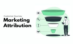
June 27, 2025
Marketing Attribution Explained: Models, Tools, and Best Practices
So, you made a sale. But was it the first ad that engaged the customer, the email that built trust, or the final offer that sealed the deal? Without clarity, you will end up spreading your budget too thin across low-impact touchpoints—or overlooking the very tactics that deserve more investment. The result? Wasted ad spend, […]
Read More -
June 26, 2025
What is a Lead Magnet? A Complete Guide with Ideas, Tips & Examples
If you’re finding it harder to win new customers, it’s not because your offering has lost its value — it’s because buyers have become more skeptical. Today, generic ads and cold pitches flood every channel. People only engage when they feel understood and offered something worthwhile. This shift has made it challenging for businesses to […]
Read More  June 17, 2025
How to promote your blog – A Guide for Businesses
You’re running a business and are extremely focused on making a product and selling it or offering a service. All went well in the initial days, but now your business has found its footing, and your customers are expecting more. You hear murmurs about something called a blog, and before you know it, now you’re […]
Read More June 05, 2025
Understanding the ROI of SEO: How to calculate and maximize it
We have all been there. You know the situation where you are meticulously explaining to the client your well-crafted SEO plan on which you spent countless days, and you think they are in awe of your efforts. But when it’s their time to speak, they disappoint you a bit by asking: “That’s all good, but […]
Read More-
May 28, 2025
What is Brand Authenticity? Why it Matters and How to Get it Right
Today, consumers are more skeptical than ever. They’ve seen the flashy ads, heard the fancy slogans—and they’re not buying it. Why? They’re looking for brands that are honest, relatable, and driven by their core values. But what does it mean to be an authentic brand? And how can you make your business feel more trustworthy? […]
Read More -
May 27, 2025
AI Search Algorithms and SEO: Your Complete Guide to Staying Visible in 2025
AI search algorithms are changing the rules of SEO. And if you’re not keeping up with the new trends, your brand can easily fall behind the competition. Recent research from Bain & Company reveals that 80% of people rely on AI-driven search results for at least 40% of their searches, leading to a 15% to […]
Read More  May 15, 2025
Executing Effective Target Marketing Campaigns – Your Ultimate Guide
The first rule of marketing is knowing whom you’re marketing your product to. Yes, the world is your oyster, but not every product is for everyone, and trying to sell everything to everybody everywhere is a waste of money and, frankly, stupid. So, unless you know who your audience is and where you can find […]
Read More


Get In Touch
Get In Touch