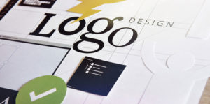
The food service industry is one of the biggest industries in the United States as of 2017, with millions of restaurants sprawling all over the country, serving everything from bacon to pizza to Sushi. Catering to different tastes and target markets, the competition is fierce as each restaurant wants to increase the footfalls as much as possible. And although the taste and quality of the food being offered is an immensely critical factor in the success of any restaurant, marketing has now also acquired center stage when it comes to bringing people to actually come and eat what is being offered.
However, marketing in the food service industry is quite different from the norm prevalent across the industry as the variables involved are quite different and the stakes here are quite high. People expect excellent quality, great service, amazing food, a thriving ambiance and a whole lot more from every food joint and all of this has to be portrayed in all marketing collaterals, especially the logo design. Whether it’s Starbucks or Baskin Robbins, every restaurant business’s logo has a story to tell, as well as serving as a signpost of all the inherent qualities that consumers look for before barging into their outlets. To have a logo as amazing and unique as these quintessential food brands, here’s what you need to look out for:
Portraying the Traits:
No one would want to dine in at an unhygienic place or a place where the staff isn’t welcoming. But before coming in to actually experience those things, your customers would take a look at the logo placed outside your eatery or food joint, so it has got to be on point and be enough to instill the sort of confidence in the customer that makes it come right in without a second doubt.
To accomplish this, you would need to make sure that your logo portrays those factors reliably. Psychologically, colors like red and yellow are in use by most restaurants, as they are more likely to stimulate appetite and convey the meaning that you have a vibrancy that will make them feel at home by having a good time.
While reds and yellows and blues are the favorites, green is now fast rising as one of the more preferred palettes when it comes to choosing a dominant color for your logo design. Portraying freshness, eco-friendliness, and nature, green is a favorite for winning over the audience in your logo design. Starbucks is Coffee titan but it uses green in its logo, which gives it a more sublime look by portraying that its ingredients are pure and fresh. Coffee isn’t green but Green has come to signify Coffee for Starbucks quite successfully in the recent years.
Standing out from the Haze:
There are millions of restaurants out there with each one trying to woo in customers, so it’s important that your point of differentiation starts with your logo design.
This logo is for a café that serves Thai cuisine and what makes this logo a winner is its uniqueness and the themes correctly resonating with what the brand is trying to tell. Elephants are synonymous with Thailand and the tree branch held by the Elephant in its trunk personifies fresh and nutrient rich food. This logo is quite easy to remember as it is a far cry from other logo designs you see that hinge on conventional shapes and patterns like a burger patty or a name written in a fancy font. You can definitely expect this logo design to pique the interest of a lot of consumers walking outside the restaurant’s doors.
Where to Go From Here:
Designing a logo is not the end of the story, you need to reach out to consumers in an effort that is designed to stay with them. With the advent of social media, this has become a lot easier and brings in a lot of footfall as compared to other conventional marketing methods. Sharing videos of the food being prepared on social media platforms (Snapchat has been a recent winner in this category), Chef talks, sharing recipes, sharing pictures of the food on Instagram are just some of the strategies you can employ to get the most out of your marketing strategy.
While social media is a great platform, you might need to have print collateral as well for having the perfect marketing strategy like banners and flyers that, if of high quality, will set the ball rolling your way. There is a host of other ways to market your food, but building a brand is what’s most important towards aiming for a sustainable business. As a restaurant owner, you would need to ensure that your eatery just doesn’t exist like any other eatery down the road that’s barely noticeable, but rather becomes a favorite and a must visit hub for people from all over town and beyond by not just having a great and memorable logo but by having the perfect marketing strategies designed by experts to make the path easier, achievable, and most importantly, sustainable.
Sports and religion share a common bond in the fact that both of them tend to boast of a similar level of loyalty towards a single identity. In prehistoric times, there were warriors who fought with each other and sports offer a similar rush of adrenaline, albeit with all the blood and gore, making it even more endearing.
Symbolism is a big part of sports and none of it makes opposing teams more recognizable than their logos, refined to be distinguished and worshiped and then worn like a symbol of pride. Fans, critics or the sportspersons themselves have an affinity of transcribing by their team’s logos.
Despite the fact that nearly every team strives to make their logo unique, memorable and more importantly an instigator of passion, few amongst them live on in popular imagination and are always held in high regard, due to the ingeniousness of the design they possess the world over.
Here are some of the best sports logo designs in History:
Manchester United
Forbes listed Manchester United as the most valuable football team in the world. This football club, based in Old Trafford, England, is renowned the world over as one of the most successful clubs in club league football. Their logo, which is quite complicated, is equally adored by the massive fan following this club has. The crest has been taken from their home, Manchester City’s coat of arms while the iconic devil in the middle is an ode to their nickname “The Red Devils”. Holding a trident, sometimes only the devil is used but overall the logo is a memorable one and is probably standing at a valuation of tens of million British Pounds.
The New York Yankees
Representing the most vibrant city in the world? You definitely would want to up your game. The New York Yankees has served as one of most visual personifications of things associated endearingly with New York City, but it’s their logo that has gone on to serve more than just be a sports logo. It’s an elegant logo design, first created by Tiffany and Co, to honor a slain police officer, but it has become a major commercial souvenir as it flocks caps, bobbleheads, t- shirts and a host of other things. The logo is easily featured amongst the most recognizable sports logos in the world with those interlocking N and Y alphabets.
Dallas Cowboys
The most valuable team in the world doesn’t own a complicated or flashy logo, yet it manages to mesmerize with its simplicity and a powerful design to boot. A 3D logo design was rarely the norm back in 1964 when Jack Eskridge went into redesigning the original logo and added a white border around the serene and sedate blue star. Being used since then, this logo represents the team’s excellent sportsmanship, its prowess and above all, its endearment to fans across the globe, especially the United States.
The Chicago Bulls
The National Basketball Association doesn’t have a fiercer logo than the one Chicago Bulls sports for itself. Yes, the club is named after a bull, but not many people know that the Bull hides something sinister within the design. See those horns and you will see a dash of red color at the ends. That’s the blood of opponents that the Bull seemingly killed with its deadly charge. A powerful image indeed but the most surprising bit of this logo is that if you go on to flip it upside down, you will start seeing an image of a robot reading a book on a bench. A smart and memorable sports logo indeed.
Sports logos are manifestations of the ideologies they carry and are displayed proudly by fans so the great ones amongst them serve as great inspirational guides for businesses and especially brands on how to make logos that connect with the largest number of people according to the brand ideology.
Read moreThe success of nearly everything on the online realm hinges heavily on how well an impression it makes with the user, whether they are ads, logos, banners or even the UI/UX interface of websites. Marketers use the word “Impressions” to gauge the number of visits each webpage had instead of referring them to as just plain “visits” because they strive to create an impact on the user, which in turn will drive the success in viewership or conversions based on how good the impression was. But that’s all about websites and the desktop front, the question therefore is, Are Apps different in catering to the word impression or are they the same?
Apps definitely are different, as making a great impression when one talks of the app domain is more important, because its not just down to opening a web page and seeing what they offer like its done on the conventional front, but its one where you have to make the user pass through the main barrier, i.e. download the app, to have them view any of the things you have on offer there.
You have a great app idea, you get down to building it, you create the perfect interface and make the app function in a way that each user will feel that the app adapted and got personalized based on the preferences. You even had great App store Optimization with all the more relevant keywords and great screenshots and an awesome description to go with it. Are you forgetting something? Is all done? No its isn’t.
The App icon is probably the most important part of the whole app domain as this is where the make or break moment happens. Apps are restricted when it comes to space and only a small title along with a short description can be made available on the app’s listing in the App store. The App Icon or the App logo is what will stand to engage the user more than anything else as in this restricted world where everything is constricted for space, Only the App icon remains the place where the app can show off what it contains inside.
Succinctly describing or personifying what the user will experience once it downloads the app, the App icon is an increasingly important facet of an App.
App stores are becoming crowded by the day, with hundreds of apps plying for user attention in each category every single day, which makes the issue of making your app stand out in this overly crowded space even more important. But the main problem arises where app developers or development companies fail to grasp the idea that investing in a good logo design or a corporate logo design to feature as their App icon will bring in good results and what is exactly a great design that would work wonders for the App.
Taking a look at most of the highly successful apps that feature on App stores like Snapchat or Pokemon Go, their App icons have become instantly recognizable and no matter how many similar apps spring up that offer the same, if not better experience, the user will be drawn to the ones whose Icons are more popular as it signifies the trust and quality of experience that these apps offer.
When it comes to app development companies, the Icons are not part of the more important milestones to cover during the app development journey. It may be a point on the agenda list but its importance is just much as for the app itself.
However, to get it straight, expecting the kind of logos that you would normally deem good for a website or a desktop version of an e-commerce store will not do the job here in the same manner because mobile is an entirely different world with its own criteria for design, scalability, user preferences, and more importantly, a perfectly crafted logo. If the user passes through an app whose Icon is too large or on the face, the screen of the mobile would make this sort of an icon turn off the user, who will pass on and move to the next app.
What constitutes a good design for a logo is a separate read but the first thing that developers should understand is its increasing importance and relevancy in the app world. Google is developing a mobile-centric indexing system which implies that how much apps will serve to dominate the future of online companies and their subsequent viability.
Coming up with something the reverberates with the masses on the app stores should be the main agenda for app developers when it comes to designing an App icon and not just make it a cheap rip-off of the prevailing trends like following Facebook, Twitter and LinkedIn’s lead and asking for the background of the app icon to be bluish. What worked for others might not work for you, keep striving for something different but without compromising on the importance and investment that you App Icon might require to make your app stand the best chance of having a great start and a sustainable following.
You’ve never seen any other logo change the way you have seen Google’s? Google Doodles are the modified Google logos that show up on its homepage to celebrate a holiday, a person or even some event in history. There are times where you yourself wouldn’t know what Google is celebrating but the Doodle will trigger your curiosity and you’ll be compelled to click on it to find out more.
So what exactly is the purpose of the Google Doodles and what does Google get out of it?
Well, the Google Doodle Department shared that the reason behind Google Doodles is twofold.
“The doodles aim to celebrate interesting events and anniversaries around the world that reflect Google’s personality and love of innovation,” is what they said precisely.
Google places immense importance on innovation. They believe their innovativeness is their core competence that has let them conquer the Search Engine Market. Google is constantly coming up with new innovations to enhance customer experience and it has taken long strides from when it first started. It’s no surprise that they celebrate innovation regardless of where and when it came from.
Google Doodles have celebrated everyone from inventors, scientists, artists, musicians and even political figures; anyone whose unique thinking has contributed positively to the world.
With their Doodles, they aim to creatively provide information on some of the world’s most integral discoveries, like DNA, NASA finding water on the moon and the anniversary of flight.
By celebrating the greatest inventions of the world, Google is subtly but very cleverly including itself in the same list, proclaiming that it too is a brilliant invention.
Every company designs strategies to connect with customers on an emotional level but few of companies have gained that sort of dependency from their customers like Google has. The verb “Google” was entered into the Oxford and Merriam-Webster dictionary back in 2006. It’s been so ingrained into our life that few would be able to imagine a life prior to Google and yet Google feels the need to further connect with its users.
Google Doodles provide users a dose of inspiration when they log in, the doodles are a fun way of delivering important messages before users continue their searches. The effort Google puts into bringing a smile to their user’s faces is much appreciated and undoubtedly makes it stand out from its competitors.
Matthew Cruikshank, a designer from Google’s Doodle team believes the reason the Doodles resonate with the users is because they show the “human behind the machine”. He bases this on how the Doodles first started.
The first Doodle was launched way back in 1998 when founders Larry Page and Sergey Brin went to attend the Burning Man festival in Nevada; they altered the logo to show that they were out of the office. The idea caught on and since then Google Doodles have become a distinctive part of Google’s user experience and identity.
Businesses are constantly advised not to change their logo designs unnecessarily because it makes brand recognition difficult but Google has managed to make its Doodles an integral part of its brand identity which shows a unique way.
With Google Doodles, Google continues its mission to providing information universally by using an exciting blend of animations and interactive games that inspire its users and leave an everlasting impression.
Read moreEvery business aims to perfect their ideal logo that resonates with their brand image. With the substantial amount of creativity and energy that goes into materializing the product/ service idea, organizations are on the constant lookout for pairing the right visual and graphical representation with their brand name.
With each passing year, some logo trends become all the more deeply engrained while new trends continue to emerge. However, the purpose of a flawless logo design continues to serve the purpose of leaving an indelible mark on your customers, so that they can recognize and recall your brand almost instantly, such is the power of an effective logo.
Familiarize yourself with the upcoming logo trends of 2017 and how they can help your business be a brand known far and wide.
Conveying the intended message with as little as possible is the new trend. Business logos in 2017 will aim to create a unique identity of the brand they are portraying with the idea of staying simple. Often it is not the extravagance or fancy fonts and colors that catch the eye but a straightforward and simple logo that is practical and purpose-driven. With the exodus of marketing messages at the exposure of public, something simple and creative wins the show. A minimalistic logo is timeless and does not need elaborate illustrations to help it stand out.
This technique of designing your logo preys subtly on our sub-conscience by incorporating the object, intended to be the center of attention in the backdrop. Contradictory much? This is where the real trick comes into play. The mind goes through an interactive mental process to try to figure out the hidden message and hence involves the individual into decoding the message. This makes the logo get embedded in our minds and makes recall faster and easier.
Logos that are set apart from the mainstream pre-set fonts and imagery by getting people to hand draw them humanizes the logo. This adds a personal touch to your logo and gets the public thinking about the idea behind the creative art. The final product seems more genuine and had some element of reality in it. The younger generation especially gets attracted to pieces of art that have logic and a unique human touch to it.
With technology reaching new and unprecedented heights, the modern look has its own way of evoking emotions and when something novel and out-of-the-box comes to the forefront it is bound to catch the attention of the general public. It’s all about playing around with the color combinations and font styles which seem to be repeating on various platforms. Retro-modern brings in feelings of nostalgia and can be creatively modified to target a specific group of people.
Last but not the least, designers have realized that cluttering a logo with too many fancy elements and inconspicuous items to be left to be deciphered by the audience is not going to work anymore. Instead, brands are aiming to make their logos as simple as possible and making them flexible across a wide variety of platforms. With visual information being so glamorous, attention spans have become situational and shorter. Hence the impact of a logo should be long lasting.
Simple logos don’t mean that you suck the life out of them and make them look all monotonous and unhappening. The design of your logo is central to the existence of your brand and this is what will ultimately determine the brand recall. Your logo design might not be spot on in the first attempt but you can always outsource this crucial task to a reputable digital marketing agency.
When we start talking about businesses, branding seems to be the single most important topic that keeps generating so much attention. Branding determines whether a business lives or dies! It’s your voice out there, it’s a way to make your presence felt and most importantly its there to engage people with your products and services by forging the basis for a powerful relationship.
But what if you are screaming in a void? A place where no one listens to what you say? When scant attention is paid to what you do, no matter how great your words are? Your efforts will end up in vain and your resources will go to waste.
Online Branding and Marketing will be done with the same ingenuity and creativity but what has changed is the platform to target consumers. Mobiles seem to have conquered all!
Mobiles are everywhere and they are expected to dominate 2017 on a much larger scale, crossing the 4.77 billion user mark the same year. Conventional desktop users are getting low and just last year, Google announced that mobiles also dominated its searches and more than 50% came through the same source, while desktop searches kept on their downward spiral.
The complete domination can be gauged from the fact that there are 1.4 mobiles per person on the planet currently. A mind boggling number and when the quantity of something crosses the number of people who use it, things are in for a radical change.
The screen might be smaller on mobiles as compared to desktops but the impact isn’t. Branding directed towards mobile users will need to become more and more customized, intelligent and worthy of getting an engagement, otherwise, just a simple swipe on the screen will take the user elsewhere.
That’s how small a window, businesses will have. Getting a new logo won’t be enough, the logo would need to be attractive in addition to being able to fit on that small screen and be just as effective. This might complicate the work of logo designers or logo design companies but it will definitely bring in ingenuity and greater work quality, benefitting everyone involved.
Google has just announced that it is moving towards a mobile-centric indexing system, which would mean that instead of its bots checking your website and ranking it according to a desktop user, they will now rank them from a mobile user’s perspective. This would signal a paradigm shift in the race to get the best ranking on search engines like Google and would also call for businesses to match their steps as soon as possible.
Not having a mobile-centric branding strategy right now, is going to keep you in the game, but not for a very long time. You are losing out on customers and valuable leads, just because your branding strategy is one-dimensional and is fast losing relevancy. 1-2 years down the road, it would be too late to make the big shift and then get used to its workings. Getting it now will make your marketing team understand how different things work on the mobile platform and develop a custom strategy for your business, optimized according to the mobile industry.
During the past 3 years, the number of apps downloaded has more than tripled; jumping from an impressive 75 billion downloads in 2014 to a mighty 268 billion app downloads predicted for 2017. The popularity of apps downloaded stem by the virtue of the unmatched ease of access they provide to brands and companies towards gaining the most out of their consumers and giving consumers unparalleled access to whatever they want, whenever they want. A revolution indeed.
Everyone gets to carry your store around with themselves on their phones through the usage of apps. Apps stay there and are not “visited” like websites, definitely making them a high and immensely influential part of the mobile-centric branding strategy.
When it boils down to who gets successful and who fails in the business world has never been down to the quality of the products you make, it’s a big factor yes, but not immensely influential at that. It’s how you portray your products and their quality and how you sell it to your prospective clients is what matters in the end. Mobiles are the future that have pervaded our present, it’s now up to us on how we make the best use of our resources to capture this phenomenon while time is on our hands.
Read moreWhen you delve out to make a logo, what are the things you start wondering about? Design, colors, graphics, outlay, texture, shapes, fonts, they are all integral parts of the logo design process, but is there something missing in there that is important?
Yes, something is missing, but the highly surprising part is that its beauty lies in being ”missing” all the time. “Negative Space” or more simply put the space leftover in between the different design elements after the process is completed, is one of the most important design components that can make a logo look infinitely great.
Negative space is quite different from the subliminal design elements in that it’s the nothingness here where the brilliance needs to lie. The Amazon logo has an arrow showing the connection from “A-Z’ which signifies that it houses all types of good for consumers and a happy smile. The connection is the subliminal message while the smile arises from the perfect optimization of Negative Space.
The negative space can be used simultaneously in two very different yet equally effective ways:
Take out a family photograph from around 30-40 years back, a time when digital cameras were not in the groove and Polaroid ruled the world. The photograph might have blurred out a bit at some places and remained sharp and stoic at the others. The human eye would automatically zoom in on the clear ones and leave out the blurred part, thereby increasing the amount of focus the clear parts get.
Negative space serves on the same premise. When you want to keep it insanely simple and not make it gaudy so that it repels people off, you let the negative space engulf the visual you have created, enhancing the effect against the nothingness behind its color and lines.
In minimalistic designs, the use of negative space is highly influential as the design itself is so subtle, that it requires the negative space to support it to make a nice impact. Logos are no different.
A lot of firms require smaller and more intricate logos that look a bit more edgy and nifty. Tech firms rule the roost with such designs as they intend to represent the quality and smoothness of experience they inhibit.
The designer and the firm who wants the logo needs to understand here that the negative space is just as important as the main element of design in the overall graphic to make for a better and much more attention grabbing logo.
It takes a master or matter of perfect communication to come with a logo design inspiration that perfectly assimilates the design with its negative space to create a complete logo, where each one has its part in portraying the meaning behind the logo.
See this logo design for instance:
The logo represents a brand named Anthony Lane and the logo works on the premise of using negative space to use both initial letters from the two words in the design. The “L” from Lane is portrayed in the negative space that arises in the Letter “A”, take anyone away and the design appears incomplete and irrelevant.
Using the negative space in a logo boils down to acknowledging the space that exists and then panning out a strategy to involve other elements by slightly tweaking this space to create another image altogether. Powerful logos like these stand a far better chance of serving your purpose of branding than other conventional ones as they portray that the brand made an effort to portray itself in not only the best manner but also with a hugely ingenious design.
Missing is not always bad, it’s down to the perception of the people involved in the logo design process on how they incorporate the negative space into their initiatives to make for a compelling and powerful logo.
Logos are at the forefront of your brand campaign serving as personifications of your vision and ideology as an organization but each different sector in business serves a different purpose, does that mean there should a different set of rules and niches for designing a logo in a certain domain?
The answer is Yes! Different sectors invite diversity in the logo domain and designing a logo for a certain sector requires the designer and the client to follow the well-defined guidelines on how to make a logo work perfectly and suit their domain. One of the most well-defined sectors that logos serve is the banking and financial sector, where the design gains much more importance than in other areas due to the nature of business.
Trust, commitment, balance, insight, integrity are all different types of strong emotions that logos from this sector need to elicit to successfully serve the business. The logos here can neither be too funky nor too sedate and serious; they have to strike just the right balance. Simplicity is the main tool to focus on here as in this sector the name of the business is an integral part of the logo, which makes it harder to initiate another sort of bright and loud designs around it.
The best logo designs in the financial and banking sector which have served their businesses and have become hallmarks of these institutions have subtlety at their command. Here are some great design inspirations that will work great in the financial sector:
The Merill Lynch Logo
This logo is intensely powerful as it contains the name of the organization and uses a bull as a side graphic. The bull signifies a powerful market in financial terminology as it’s connotation is with rising prices indicating profits.
The bull has its front leg and its tail up signifying an aggressive stance that goes perfectly with the company’s work of providing the best of profitable investments to its clients. Simplicity is of high significance here.
Barclay’s Logo:
Barclays has been a highly trusted and well known financial institution for many decades and its logo which shows an eagle alongside the text, represents being high and powerful. The eagle is also shaped like a knight’s armor shield which gives it the provocation of power and protection making Barclays gain a reputation for being a company that is head and shoulders above its contemporaries and provides financial protection to all kinds of investment in its foray.
Deutsche Bank:
The logo here is one of the best examples of innately powerful simplicity and utter creativity in a minimalistic design. As I told you earlier in the post, the text is immensely important in financial logos but the accompanying image, if any, should be intrinsically beneficial to the cause of the logo without overdoing it.
Here we see a square with a diagonal line going in the middle which subtly represents the “D” of the Deutsche brand and the easy feel of the look make for great brand recognition making for an instantly recognizable logo.
Off Market Design Inspiration:
If you want to veer off the serious minded track in logo design for your financial concern and are looking for a more colorful and vibrant design which doesn’t go over the line, then this design inspiration is for you.
The Design shows a tree growing amidst the pebbles, signifying growth in the real estate opportunities the business offers. Considering the fact that people invest in real estate in the hope of leveraging their money for high returns, this logo has the perfect symbolization to serve that purpose. A must consider for those who like to go offbeat and break from the norm.
Off Market Design Inspiration:
If you want to take your logo a more upbeat level that portrays less seriousness as compared to other financial logos then this logo design is a must-consider option for your business. Firstly the color purple is a paradigm shift from the dominating palettes of blues and greens in the financial world and secondly the circular design gives a feel of a “Smiling Face”, which other financial institutions won’t opt for, giving your logo its own identity.
Logo designs are at your discretion as a business owner and depend on the initial brief you give to your design team about how you want it to look and feel like. It’s your call at the end of the day, but it would be advisable to look for sustainable designs according to ongoing trends and previous preferences across your industry to have a fairly good idea of what will work and what won’t for your brand.
Since prehistoric times, our minds have been hardwired to understand and respond to different kinds of stimuli that aided us in our survival in those wild times. But those psychological underpinnings still do hold value as we elicit the same kind of emotions after seeing certain colors as we did back then.
The perception a person takes away after being exposed to a certain logo is largely dependent on the color of the logo. Yes, the design is immensely important, but color is a stimulus that can change the immediate outlook of your logo to the extent of altering its meaning by eliciting different passions and emotions.
Most of the iconic logos out there are more associated with their colors than they are with their design as a Mcdonald’s logo will be immediately recognizable at even the haziest of days just because of the yellow color that constitutes a major part of the minimalistic logo.
When opting for a new logo design, color is dependent on what vision you are trying to portray to the onlooker and what does your brand stands for. The key here is to pick the perfect color or a combination of colors to match your brand ideology perfectly to make a powerful impact.
To understand the different emotions that each color elicits, we have some of the most popularly used colors in logos for you here:
The Subtlety of Monochrome:
The colors black and white do not exist alone as one cannot be present without the other although the hues used each time may differ.
Black signifies formality and the elucidating darkness of the night while white is a proponent of peace and composure and together they portray a silken image that is not present in any color making it a perfect color palette to apply when you want a vintage logo for your brand.
Monochromes are great when used to signify technology and innovation and are used mostly by companies that do not want to give away what they do with their logo but just act as a personification of their vision.
The logos of Apple and Nike are built on a monochrome theme but they just signify the calmness of being great at what these companies do without making too much of pomp and noise.
The Power of Red:
When we talk about the color red, the power here is innate and it portrays passion, aggressiveness, and intensity to the fullest making it a powerful candidate for any brand that vouches to look as a constantly active entity with élan.
Companies like YouTube and Coca-Cola have red as their primary logo color to signify the dynamic nature of these brands and the product or service they offer.
The color red stands to increase or stimulate appetite and consumption which stands to explain its use in so many food and beverage products.
The Harmony of Green:
When used wisely, the color green can create an instant connection with an onlooker as it is one of the most abundant colors in nature and stands to elicit the feelings of earth and relaxation just like sitting under a tree.
The connotation is evident in all forms of this color when used in a logo as it provides the logo with a feel that it is fed by natural flavors or possesses a growth-oriented approach.
Money and financial products have long been associated with the color green and its use in such companies is great as it makes it easier to portray the phenomenon of prophesizing sustained growth that will remain fresh for long.
The color green has also been used in the Android bot logo by Google as it portrays the wealth of applications and functionalities that the domain offers.
The Authority of Blue:
Blue is symbolic of governance and professionalism and is one of those colors that elicit integrity and trust in the brand logo that aims to incorporate it.
Blue is present in the horizon and the sky and brands with such a vision should opt for this color to give more weight to their cause by the use of their logo.
When using blue, keep in mind that it implies faith and trust which is the main proponent of companies like Samsun and Ford that reek of quality in all of their products making blue the perfect candidate for portraying a confident yet conservative stature of a brand.
The list doesn’t end hereas there are other colors you can use when you get a logo like orange and purple which are used on an equally consistent basis in logo designs and have their own set of emotions with them but what we intended to make you understand here is the power of colors in making your logo impactful which has the ability, if done right, to transform the chances of success of your brand in the marketing world.