

Our Work
QTIS

QTIS
All
Things
Food
All Things Food
Uncommon
Uncommon
What you can expect from us
Custom Design
Our team of experts provide the best custom designs which are suitable for your business. The design is based on your content and most of all, your strategy. We make sure every element is up to date with the latest designs and continue to make any changes where necessary.

Swift Services
We continue to maintain a great relationship with you after experiencing our services. Our team is available for you at all times to cater your needs. The professionals at PNC Logos are great with co-ordination and provide an instant solution to your concerns.

Multiple Concepts
The professionals at PNC Logos are so creative that coming up with only concept for your business design isn’t enough. A variety of designs are presented to you and all you have to do is choose the best one! Why limit your business to only one design?

Dedicated Account Manager
We realize the importance of keeping in touch with you throughout the process. Our dedicated account manager keeps you updated about the projects and delivers your messages. If you have any changes or concerns, do not hesitate and feel free to share. Your opinion matters!

Timely Delivery
Time matters at PNC Logos! Delivering your projects at a given time frame is what we’re all about. Our team goes out of their way and put in great effort to meet deadlines. We will leave you impressed with our commitment.

Multiple Revisions
Revision is mandatory before finalizing a project. We ensure that everything is perfect and fix flaws immediately. Our experts are quick at spotting mistakes and have the perfect solutions. Even after perfecting the project, we revise it one final time before delivering it.


Our Satisfied Clients
A good logo can significantly boost your business and our talented team of designers and artists can create a mesmerizing logo from scratch. With our Custom logo design company, you can bring your imagination to life without blowing your budget. We carefully assess your business demographics and give you exactly what you want. After all, you and your company deserve only the best. There is dedicated support at every step of the process and we take care of all revisions to guarantee 100% satisfaction.
Video
Video
Video
BELONGING TO 45+ INDUSTRIES!
-

Sports
-

Spa / Skin Care
-
Security
-
Science
-
Salon Logo
-
Remodelling / Furnishing
-
Real Estate Logo
-
Printing & Publishing
-
Photography
-
Pharmacy Logo
-
Music / Entertainment
-
Medical / HealthCare
-
Law Firms
-
Landscape / Agriculture
-
Kids / Toys
-
Insurance
-
Information Technology
-
Illustrative
-
Fitness Logo
-
Fashion / Apparel
-
Event Management
-
Environment / Eco-friendly
-
Dog Logo
-
Dental Logo
-
Corporate Logos
-
Cleaning Company Logos
-
Church Logo
-
Aviation / Logistics
-
Automobiles
-
Aqua / Marine
-
Animal Logo
-
Accounting Logo
Our Blog
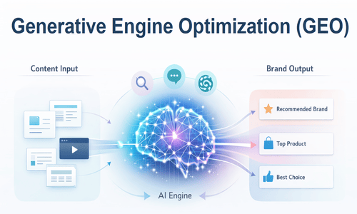
Today, 25.11% of Google searches show an AI-generated answer directly on the results page, as per a Conductor 2026 Article. And Google isn’t the only place people search anymore. Millions now ask AI tools directly. ChatGPT alone gets over 5 billion monthly visits and ranks as the fifth most-visited platform globally, according to SEMRush Data. […]
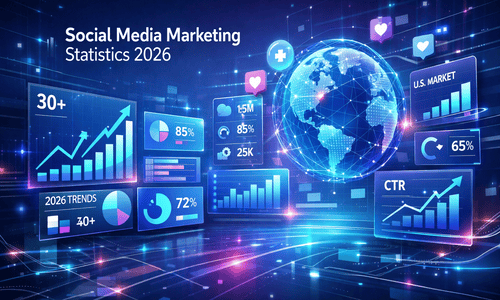
Millions of Americans are on social media in 2026. And they’re not mindlessly scrolling. They’re using social media to intentionally discover, research, and buy. Successful social media marketers align their strategies with this behavior. In fact, 79% of marketers use social media content (organic and paid) as part of their overall marketing strategy, according to […]
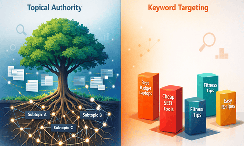
Imagine two competing websites in the same niche. One has over 50 blog posts, each targeting a single keyword. The other publishes half as much but links every post around a central topic. Six months later? The second site still ranks on page one. The first? Ranked and disappeared. That’s the whole essence of the […]
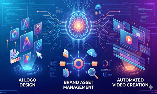
For small businesses, building a strong brand identity can be financially exhaustive. Yet without a strong visual identity and consistent messaging, how do you compete with deep-pocketed rivals in crowded markets? Artificial intelligence has made this much easier. Emerging AI tools for branding have made professional-quality brand assets and management accessible at a fraction of […]
Get In Touch
Get In Touch